Tuesday, March 31, 2015

Teacups for High Point Wholesale Market

Pen and Ink style Teacups for the Kitchen


This is something fun and different for me.  It's hard to say which one that I like better.  Truthfully, I think they all look 
well together.  Buy them all! 

Love the red ship! 

I think that this one looks the most like the style that you are accustomed to reading about on this blog.  I Like it, but I also equally like the more graphic versions, too. 

My favorite cup is the polka dotted one! 

I really think this one is my favorite.  I can't say why.  Maybe it's the rich red colors.  I wish that I had a set of dishes to match these designs.  Imagine a big dinner plate with those white polka dots with a red background! 
Love the flow blue! 

There's something pretty about stacking cups.  Have you ever noticed how beautiful teacups look in your cupboard if they are stacked?  The tricky part is getting them out of there without knocking the whole stack over!  It happens. 
The graphic one on the bottom looks so neat with the black polka dots! 

I love the teal/turquoise quality of this example and love the white cup on the bottom! 

Spring! 

This reminds me of spring! Spring, please come! 

Love the orange!  A nice splash of color! 

This set is fun, too.  I like the silhouette of the black cup on the top.  The Silhouetted cup is really what makes the set fun and different.  

Here are the six! 

What fun!  Look for these are Market in High Point April 2015!  We are in the C & D building! 

Hope to see you there! 

Enjoy! 

Monday, March 30, 2015

Creating a Portrait - Part 3 - For the GARDEN CLUB OF VIRGINIA HISTORIC GARDEN WEEK garden tour in Gloucester, VA

I think I might have finished this portrait

 except for choosing a frame 


I am debating if I will even put this behind glass! 


Sweet little face with strong chin! 

I have shown a lot of different options that could happen with this portrait with regard to the framing.  I feel after much deliberation, that the gold frame looks the best.  I know that some of you disagree, but I had an overwhelming positive response to this gold-leafed frame!(ABOVE)  


Well here she is!  I am very pleased with how she turned out.  The method that I used was my Retrieved Wallpaper technique.  This is also the method that was used to paint my Central Park scene (Refer to last year). 
Love the splash of color and all the crazy cracks! 
I really enjoy painting this naive style.  It makes me happy, so I am intending to keep doing it!  If you have any strong opinions about the frame, simply like KOLENE SPICHER on Facebook and leave your feedback. Choose the page that I manage and not my personal FB, please.   Or if you prefer, you can leave it on this blog, too.
Frame Number 1 (I think this is a little heavy and dark…)

Frame No. 1

While this frame is gorgeous, I think it might be too thick and heavy.  I just don't know.  The frame can be a deal breaker…

I like this one, but guess what, it doesn't fit.  I would have to pay someone to 'doctor' the size.  Sometimes this doesn't look right…
Frame No. 2 
I like this one, actually, but would have see if I could have it trimmed down.  It might, in the end, be more time-consuming than it's worth.  I do like it, though :) 

Frame No. 3
This one has the same problem as No. 2.  I would have to adjust the background, which would be easier than No. 2.  However, I really like the gold.  But then The style might be limiting, most people do not have this fancy of a house (although, these gold leafed frames are coming more and more into Vogue).  I was recently in NYC at the Restoration Hardware, and they have an entire wall of these made into mirrors!  It was amazingly beautiful against their dark grey backdrop. 

The fourth (No. 4) option would be to make one and grain it.  I sort of like this idea!  What do you think? 

The FIFTH option is This!  I would have to cup the bottom of her dress off to accommodate this frame. 


I think that I like this red frame…

Finally, here is what it would look like as a business card.  The info is on the back, I was told not to include this over the internet.  Not sure why, I guess spam.  If you look closely at this print on image No. 3,  1/3 of the way up on the left, my signature was temporarily penned onto the paper.  I am going to remove this and re-sign it on the lower right.  This was only done for the business card! (See below). 
Front
I really think this turned out well.  I will be handing these little guys out at the Garden Club of Virginia Historic Garden Week Garden Tour showing.  I am excited to help my friend with this event!  I am at the house named "Nesting" on April 25, 2015! 


Thanks so much for looking today! 
Enjoy! 


Friday, March 27, 2015

Creating a Portrait - Part 2 - For the GARDEN CLUB OF VIRGINIA HISTORIC GARDEN WEEK garden tour in Gloucester, VA

Choosing the Frame and creating the pencil drawing.


Pencil drawing on my created textured background
Well, I changed my  mind.  I decided that I wanted to make the face larger and not include as much as the body.  I know that I said in yesterday's post that I liked the full body poses, and while that remains true, I drew this out and decided that I liked the head to be more prominent.  I also like the sweet little hot dog.  I am not sure how it will all play out but for now,  but this is what I have to show you.
Love the paper
This crinkled paper is a process that I developed two years ago.  I love creating it and it took hours for me to get it to look the way this does.  The crinkles are much more subtle than the Central Park Ice Skating scene that I painted last year ( refer to this post) .  I wanted the little girl and the dog to be the "Stars."


For the frame (for now), I have chosen this OGEE 19th century grained frame.  I think it will compliment the colors of this painting very well.  Refer to yesterday's post, I am trying to reproduce a portrait that could hang along side the "Blunt" painting from the early 1800s.  I know the frame is not exactly correct, but I like it! 

Closeup of the graining
I love the patina of this! Only years of being used and lugged around and stored can create this!


My goal is for the painting to sit inside this and be museum mounted.  I needed something with a deep rabbit to achieve this look! 

Tune in for more! 

Enjoy! 


Thursday, March 26, 2015

Creating a Portrait - Part 1 - For the GARDEN CLUB OF VIRGINIA HISTORIC GARDEN WEEK garden tour in Gloucester, VA **Updated with additional photographs 3/29/15

I painted a portrait reproduction similar to the one below!

Kolene Spicher Portrait, Ship scene, and Landscape that is being featured in a prominent Virginia home for Historic Garden Club Tour 


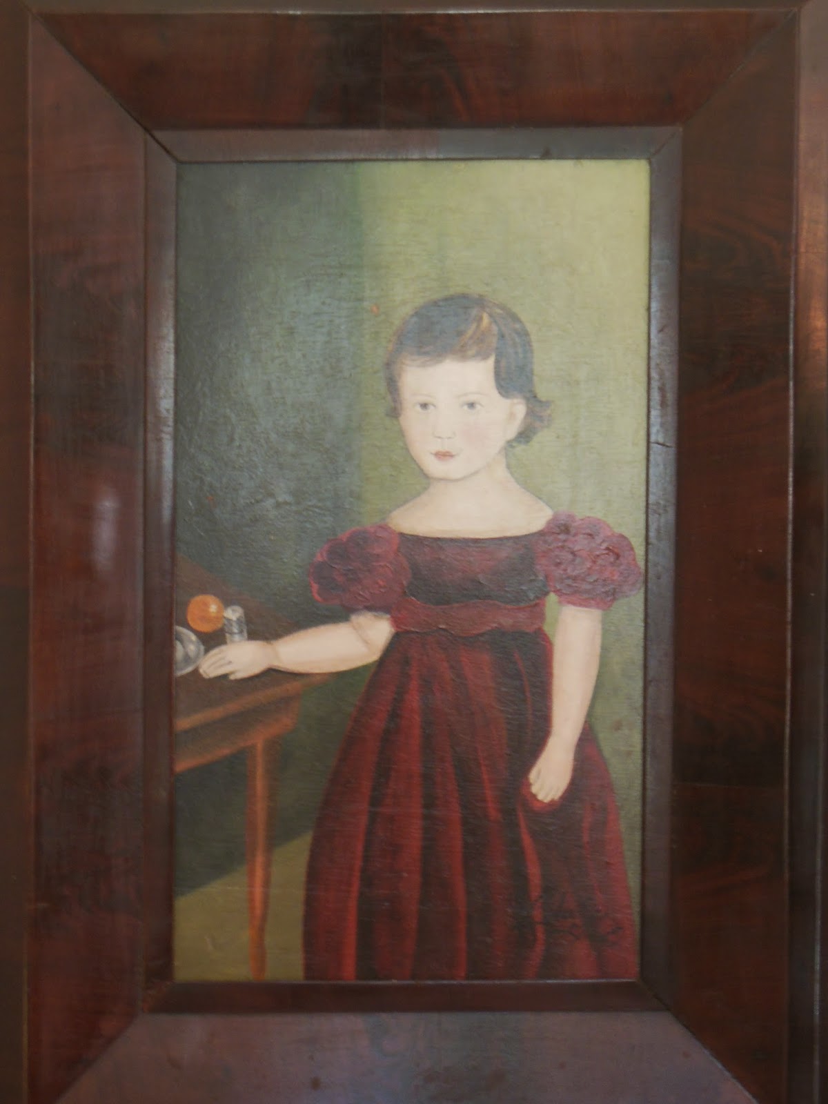
A few years ago, I painted a piece after the likeness of this painting.  It was purchased by man from Virginia.  Today, my version (Portrait B)  proudly hangs in his home in the dining room.  Today, I am starting another 'Blunt' style painting which I intend to sell later but for now turn into a business card.  I thought it would be fun for you to follow the process.  


This is the Original Blunt painting
1785-1830
Version A


This is my version (below).  The feel of the two are similiar but the painting technique is different, as should be the case of any painter.  I am starting a third "Blunt Style" today. **See Creating a Portrait - Part 2 - For the Garden Club of Virginia...

The original Kolene Spicher
Version B

Things that stand out to me about this painting are as follows (I list them in importance to the overall success of the painting, as I see it). 

Face- this little boy's face is very sweet.  Although, he looks serious it's only because his dress was tight, Ha.  

Proportions - the proportions of this painting are good and well executed.  Often times, the head may be overly large or small.  I don't feel this is as desirable.  I Like the proportions to be correct. 

Splash of color - I love the orange.  I think a dark painting always needs something bright.  I intend to include something bright. 

Full body - While head shots can be sweet, I truly believe that the full body shot is more desirable.  I include as much of the body as the frame will permit.

Color-The colors are rich and dark.  To change it up a bit,   I intend to brighten the next painting just a little bit.  However, it will still need to be executed using dark colors or it won't look "Blunt" style.

Watch for the development of this portrait. (Creating a Portrait - Part 2 - For the Garden Club of Virginia…).  

Here are a few interior shots with my paintings hanging on the wall.  This house is FABULOUS.  I cannot express with a few pictures the extent of the collections that are within the walls of this Virginia Colonial. 

The "Blunt" Style portrait is behind the left potted tree.  The Ship scenes are Kolene Spicher, too. 
I love the use of props and staging that are present in each of the rooms in this house.  The owners should run a magazine!!

Kolene Spicher Portrait on far left.  The two portraits over the mantle are 18th Century Original Paintings.

~Today, I am going to start working on the background for my 2nd 'Blunt' style painting!  I will select a frame for this piece, too.  I may make a frame, too.  I am not certain, yet!  

A LITTLE ABOUT THE GARDEN TOUR 

THIS IS THE HOME THAT I WILL HAVE MY ARTWORK FEATURED.  IN THE TOUR BOOK, IT IS TITLED "Nesting". 

The tour takes place Saturday, April 25, 2015.  I need the business cards for this event!    The homes that are featured spread across the commonwealth of Virgina.  Each  section of the state will hold tours  on a different day starting Saturday, April 18 and finishing  up on April 25, 2015.   

Please visit www.vagardenweek.org for more information.   


A little Blurb that was written about this home (BTW, I am the guest not the Antiques Specialists).


Sunday, March 1, 2015

Girl with Mask, Part 2

When the painting still isn't finished ~ You add a bird! 


https://www.etsy.com/listing/222659217/kolene-spicher-original-painting-of-a


I kept walking past this painting and doing a double take.  What is on that girl's shoulder?  It looks like a bird.  Okay, it was her bow.  However, because I kept seeing a bird, I decided that a bird should be there.  This is one of the many licenses I take when I paint.  I can't tell you how many times I have assembled a painting only to later tear it apart. 


Here she is with her mask pulled down! 


And here she is put back together.  Don't forget, you can pull the mask right off! 

SEE Feb 28, 2015 post. 

Enjoy!