My latest Whaling Painting from start to finish for Nantucket Country, Nantucket, Mass.
How I choose my color palette
Whaling Painting - Part 2
Whaling Scene - Pencil 'version'
Whaling Scene - Pencil 'version'
 |
| Whaling Scene Pencil drawing - Rough Draft |
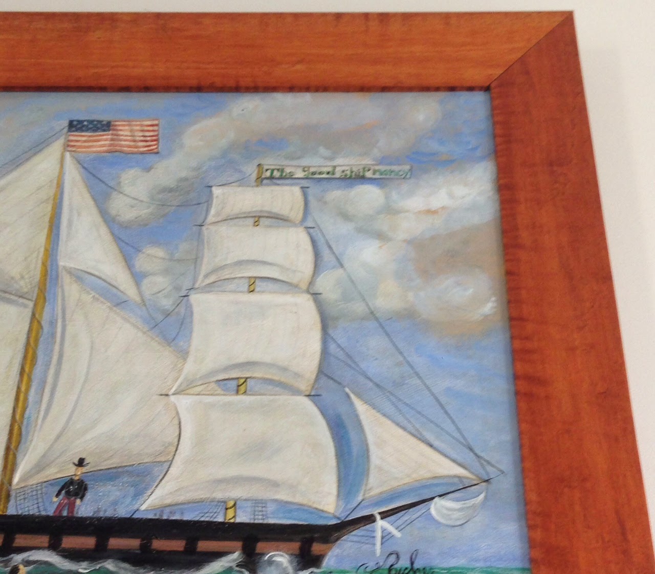
The above little scene shows the direction that I will be painting toward. I want there to be LOTS of action and beautiful wavy water. Because I happen to know that the frame is a tiger maple frame, I want the colors to be in the Cerulean Blue range. They will compliment the warm hues that are present in maple. BTW, the frame is an antique and fabulous. Plus, my skies are generally painted with this color somewhere. There's nothing worse (to me) than messing up the sky.
 |
| Color palette but with deeper hues |
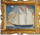 |
| Example 1 |
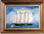 |
| Example 2 |
Thanks for looking.
Enjoy!

No comments:
Post a Comment